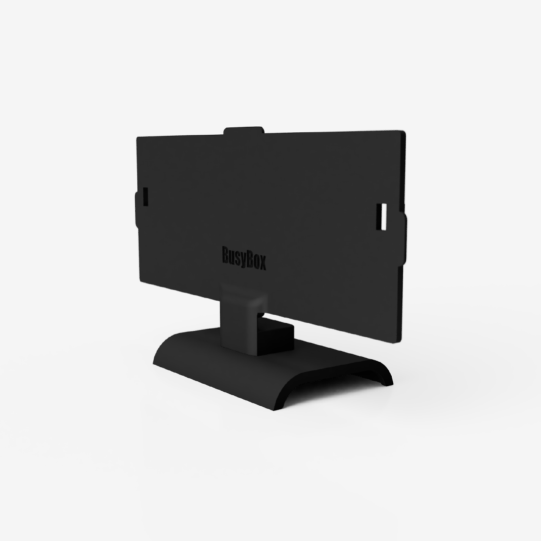
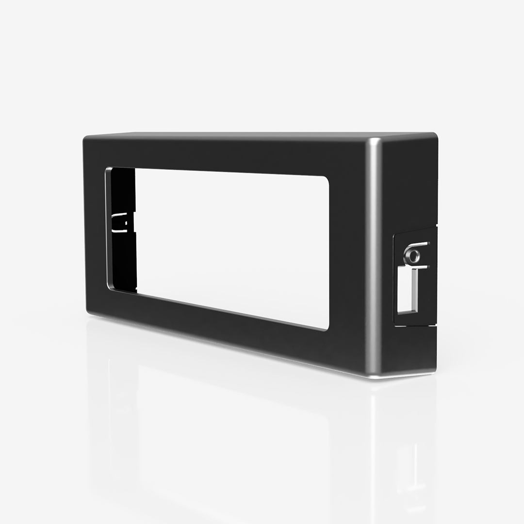
Why the BusyBox Sign Is 8.5″ Wide (And Why That’s the Sweet Spot)
We often get asked two things:
“Why isn’t the BusyBox bigger?”
…and just as often:
“Can I get a smaller one?”
Here’s the engineering team's answer: based on our research, 8.5″ is a great size for optimal visibility, battery life, usability, and overall effectiveness.
Below, we’ll explain why, based on real-world testing and feedback from thousands of users (many of them musicians and creators like us).
📏 Q: Why 8.5″? Is that really the best size?
A: Yes. After testing different options, we found 8.5″ wide is the sweet spot for our smart signs. Here’s why:
-
Easily visible from 15–25 feet — no squinting or guessing.
-
Avoids visual clutter — doesn’t take over the door or wall like larger signs.
-
No electrical noise — our sign is DC-powered, which avoids AC hums in studio setups.
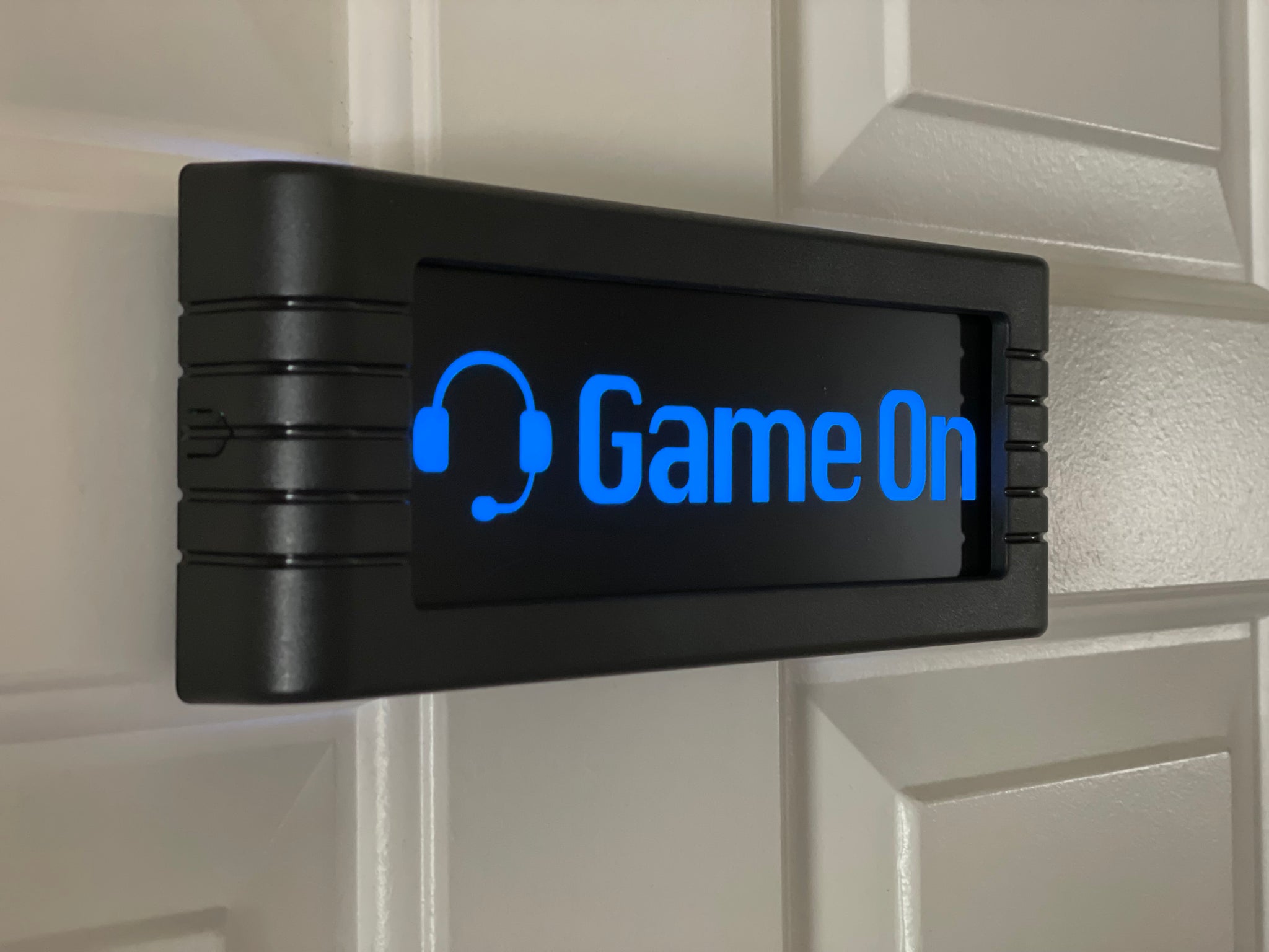
If you’re using BusyBox in a recording space, shared office, or home studio, this size is designed to be seen, not dominate.
🔋 Q: Why not go bigger?
Because bigger = battery drain.
-
Larger displays consume significantly more power.
-
Bigger units usually need to stay plugged in — which limits flexibility and creates more cable mess.
-
BusyBox is wireless and portable by design. We wanted all-day battery life, and this size delivers that.
🧩 Q: Why not go smaller?
Because smaller = less effective.
-
Smaller units get missed more easily, especially in hallways or with fast-moving foot traffic.
-
There’s less room for readable text or clear color indicators.
-
In our tests, anything smaller reduced the success rate of someone noticing and understanding the message.
That said: if enough people want a mini-BusyBox, we’re open to exploring one. Let us know! Email us at Support@BusyBoxSign.com and let us know your thoughts!
🚪 Q: What makes this size better for placement?
-
Fits cleanly on glass panels, studio doors, office walls, and even narrow hallway frames.
-
Doesn’t interfere with door handles or hardware.
-
Looks balanced, not too flashy, not too subtle.
It’s a size that plays well in creative environments and professional spaces.
🎙️ Designed for Creators by a bunch of Musicians
BusyBox was built by a team of musicians, engineers, and creators.
Our founder created and co-founded BandLab.com and worked at Bose in the live sound division. Our team is full of musicians and are into signal clarity, focus time, and making tech that work well and look great.
🎛️ Recommended Presets for Studio Use
Want to use BusyBox in a studio? These are the go-to presets we recommend:
|
Status |
Color Setting |
Why It Works |
|---|---|---|
|
🔴 Recording |
Solid or Slow Pulsing Red |
Clear “Do Not Disturb” signal without being aggressive |
|
🟡 Mic Check / Prep |
Solid or Pulsing Yellow |
Subtle alert without locking out collaborators |
|
🟢 Available |
Solid Green |
Safe to knock or engage |
|
🔵 Mixing / Focus Mode |
Solid Blue |
Maintains focus without feeling like isolation |
TL;DR
-
8.5” = A perfect size for readability, placement, and aesthetics
-
Not bigger because of battery life + visual noise
-
Not smaller because it loses effectiveness
-
Designed for creators, tested in real-world environments, inspired by decades of "Recording" and "On Air" signs.
We’re always improving, and we love your feedback.
If you’d like to share how you’re using your BusyBox — or want a different size or feature — let us know. We’re building this for you.
Keep busy,
The BusyBox Team